Challenge:
Atkins RV requested revisions for their website. Their website also needs an updated, modern look, including simple, minimalistic elements in order to present key information more clearly. The overall number of pages must also be minimized.
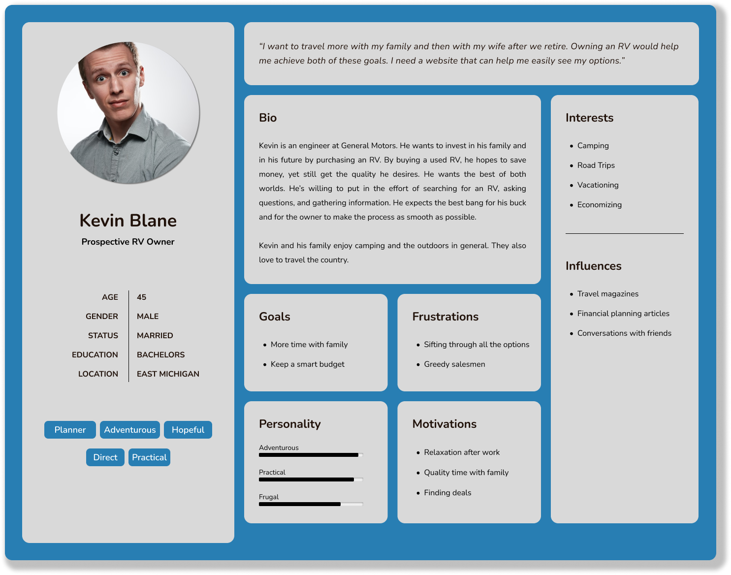
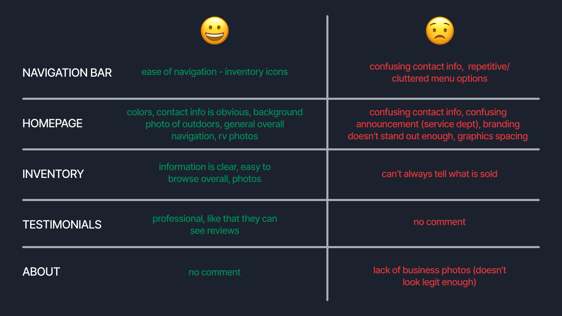
Surveys were created and sent to users to gather information. After analyzing 12 responses, common pain points were identified. Based on this information, solutions were determined and implemented. A user persona was also created using polling data.
Atkins RV has also requested a new, modern, and simplistic logo, including a “road” element. You can view that project here.
Solution:
Based on the pain points identified, the following was implemented:
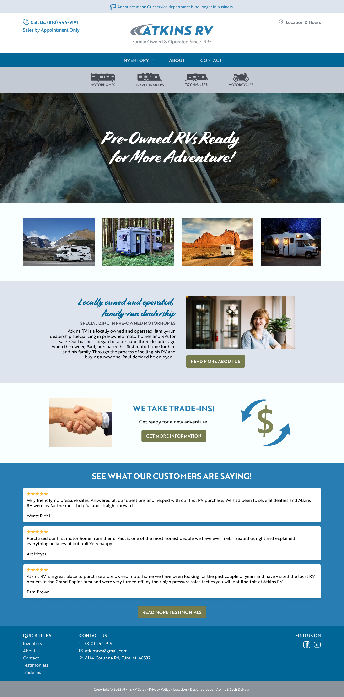
1. Decluttered, simplified, and removed repetitive elements from the homepage, especially within the navigation. This reduced distraction and increased ease of use.
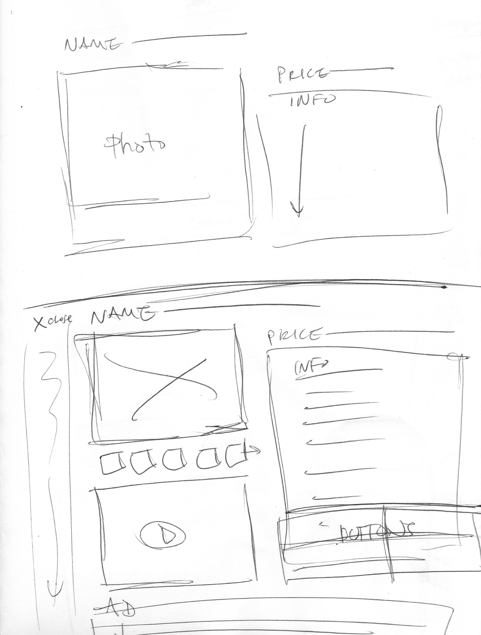
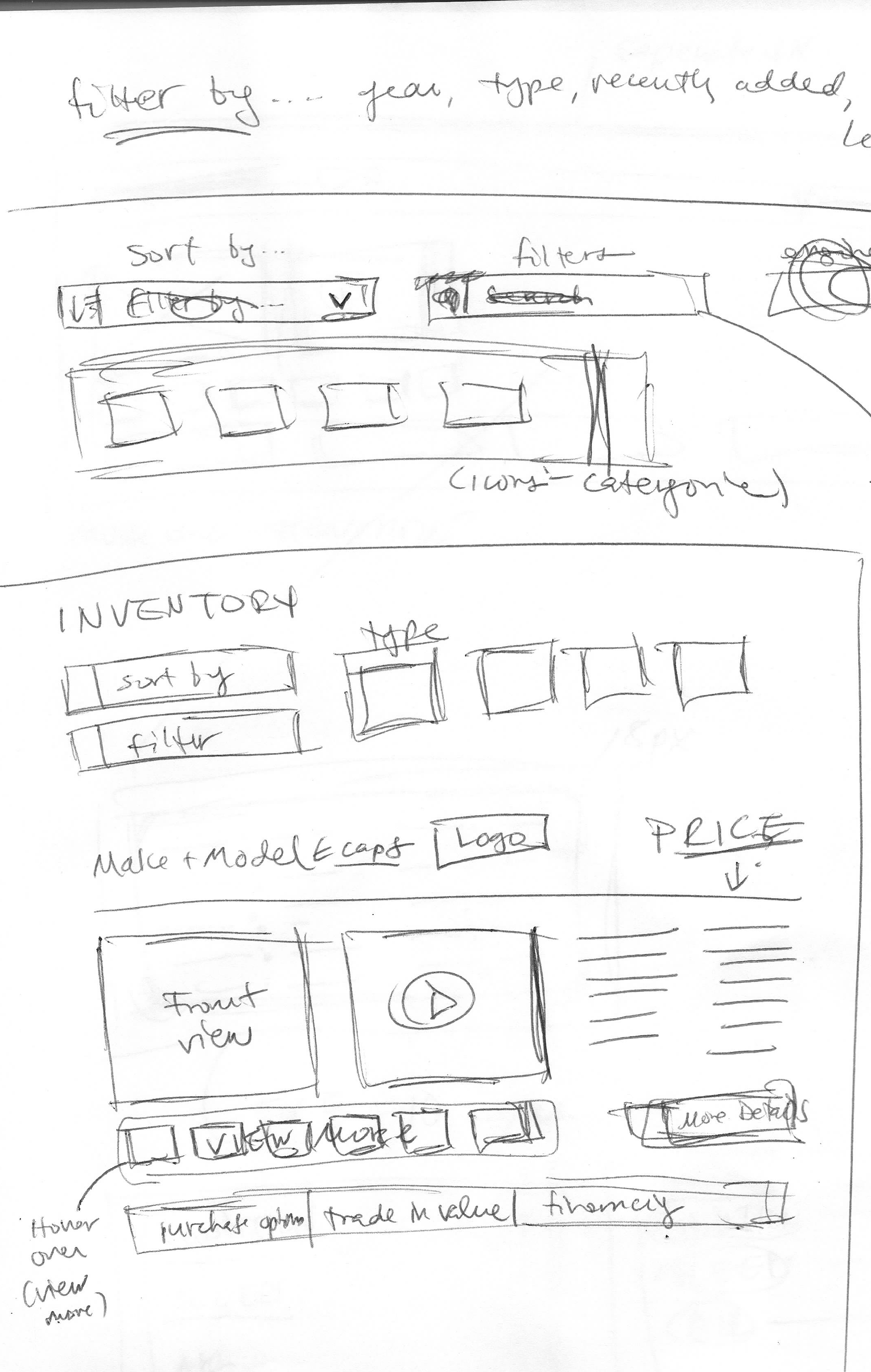
2. Updated the appearance of the inventory listings to a more simple, minimalistic look that presents key information clearly.
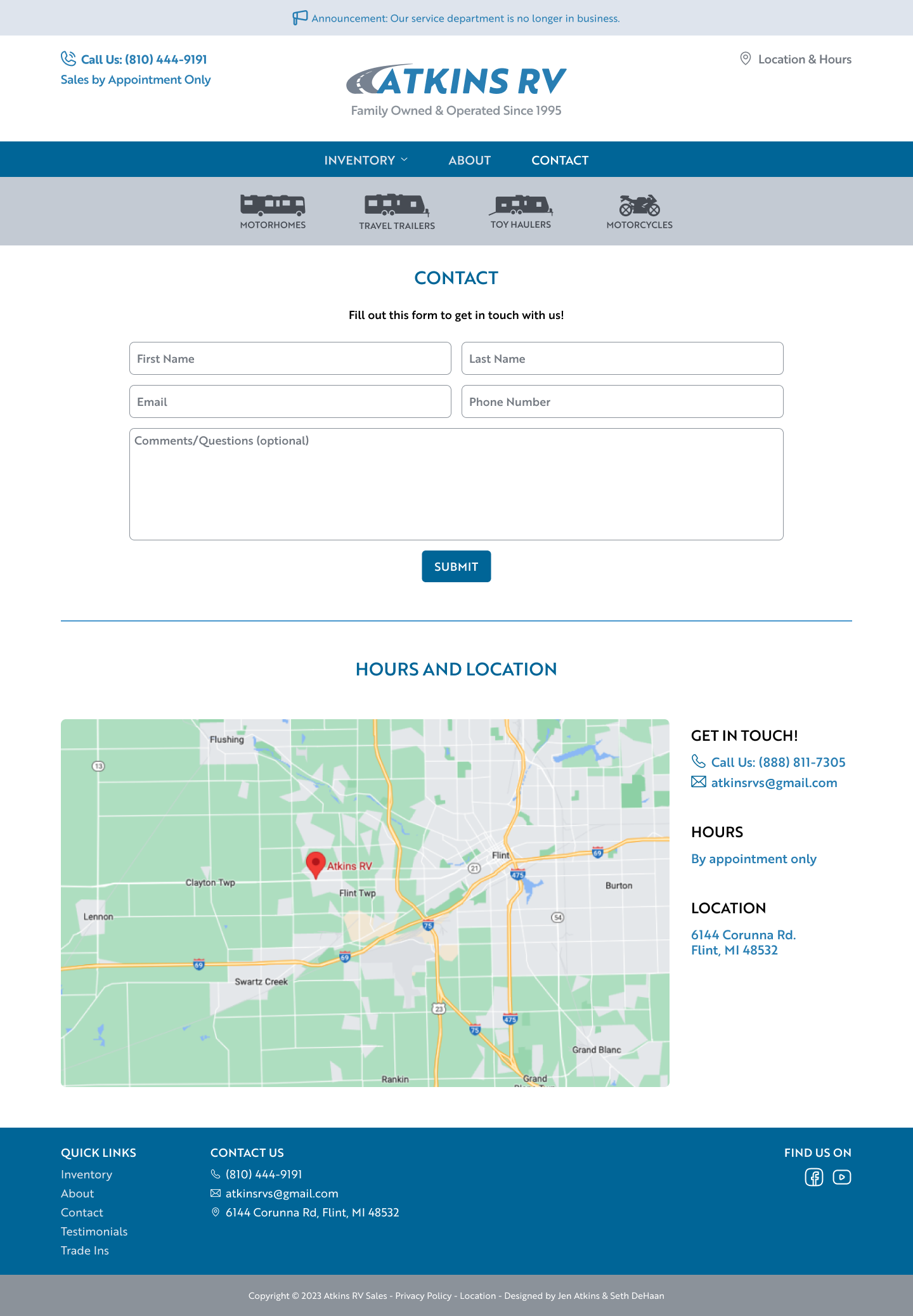
3. Minimized the number of pages overall; keeping it simple. Combined and removed pages as necessary to achieve this.
The result is a website that is easy to parse, enjoyable to use, and aesthetically pleasing to view.
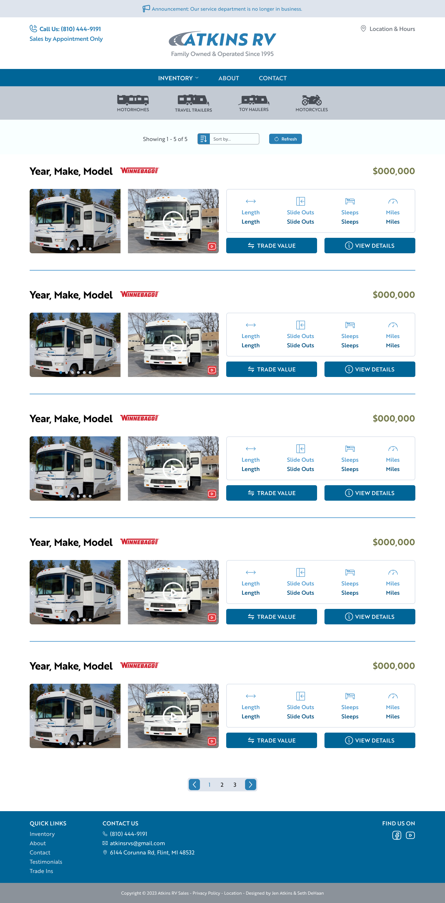
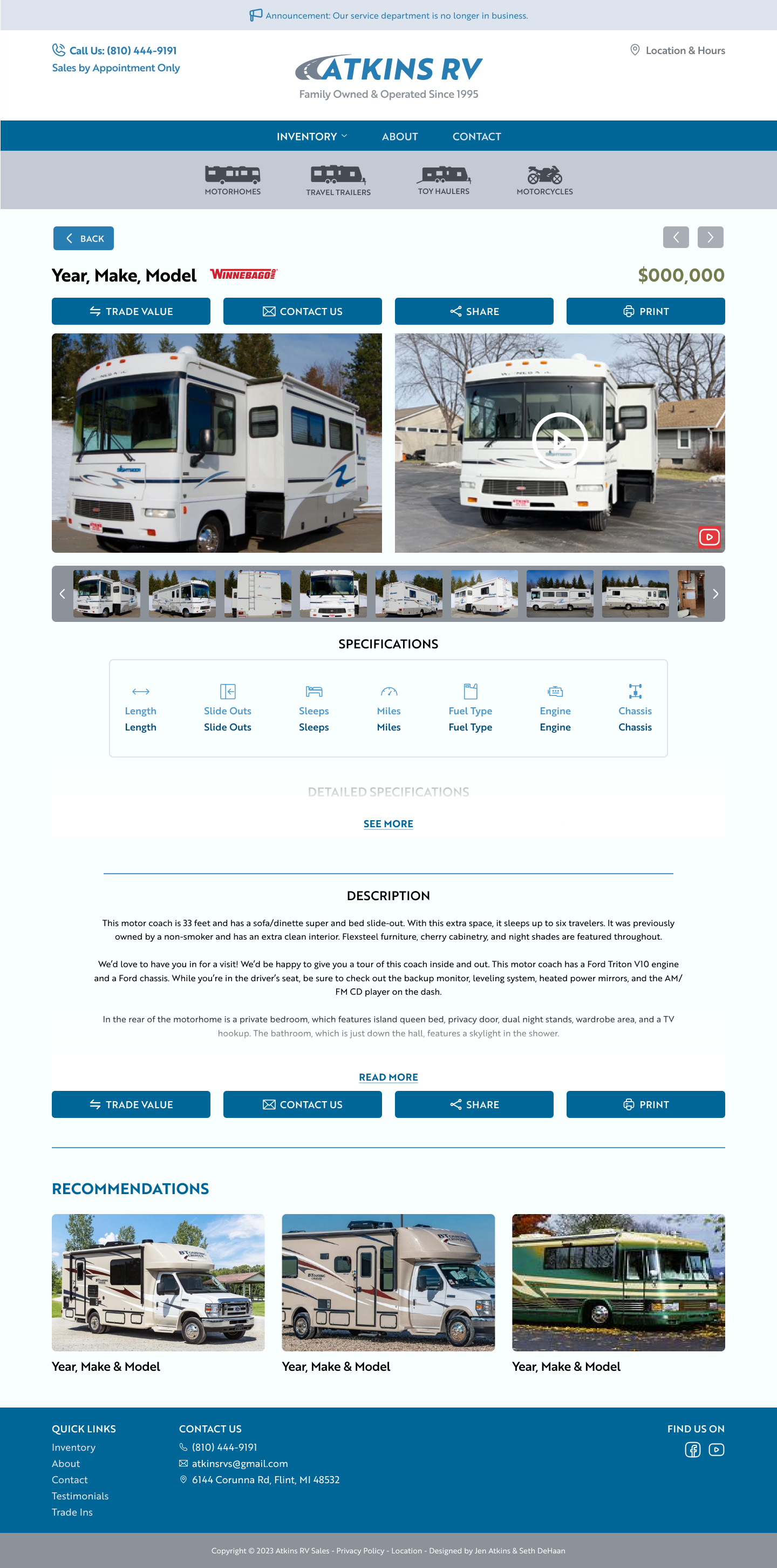
Below are sketches of the Inventory page.
