Challenge:
Atkins RV has requested a redesign of their old logo. They are looking for something more modern and simplistic. The only requirements are that a new color is chosen and that a road element is still used in the new logo.
Scroll down for Solution.
Solution:
The old logo has been determined to be almost entirely outdated, with the exception of the road element. Blue was chosen as the new branded color due to its friendly, calm nature. The font selected is both friendly and easy to read. The road element was added as a much more simplistic, realistic alternative that draws the viewer’s eyes across the logo to the right.
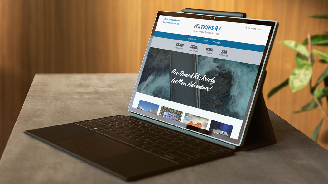
Atkins RV's new website, which I also redesigned, can be viewed here.
